Design
Principles
From a single line
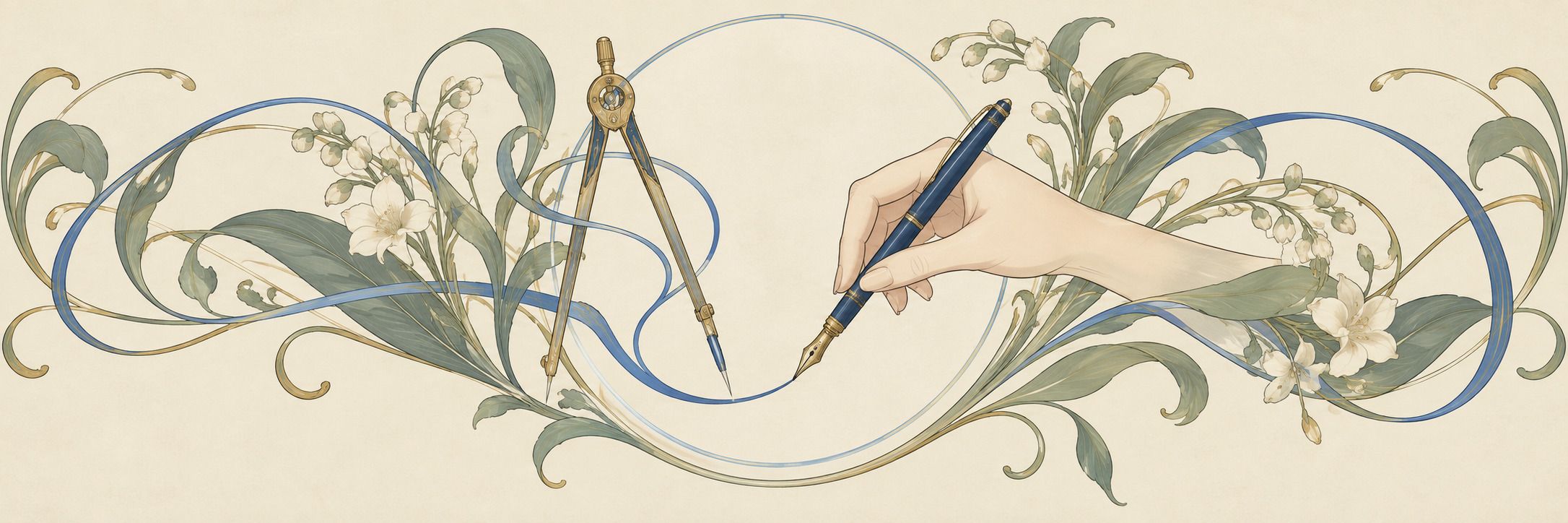
Our OW logo is drawn with a single line of even weight. Our lettering, diagrams, and interfaces all start from the same construction.
Quiet and precise
Rather than catch the eye with ornament, we put accurate information in an order that is easy to read.
A person tries it last
Agents build it. A person then uses it and decides by how it feels in the hand.
Rules written as instructions
We write our rules for color, type, and spacing so that people and agents read them the same way.
Design system
This website is built using only the rules shown here. Once the system has matured, we will publish the rules in full.
Logo
A closed O and a flat-topped W, drawn with a single line of even weight. The stroke is about 19% of the logo’s height. We chose it from sketches our founder drew by hand.
Monoline lettering
The “AI / DESIGN / COMPUTING” lettering is drawn letter by letter, built the same way as the OW logo: even strokes, flat ends, rounded turns.
Color
Provisional colors: a navy and three blues, with the paper, gold, and green of our illustrations.
Navy
Ink
OW Blue
Deep
Sky
Gold
Sage
Parchment
Paper
Type
Quicksand
Our World
Raleway
Intelligence takes root
Noto Sans JP
知性が芽吹き、実りある世界へ。
DM Mono
v0.3 · 2026.10.06
Work
SnapCap
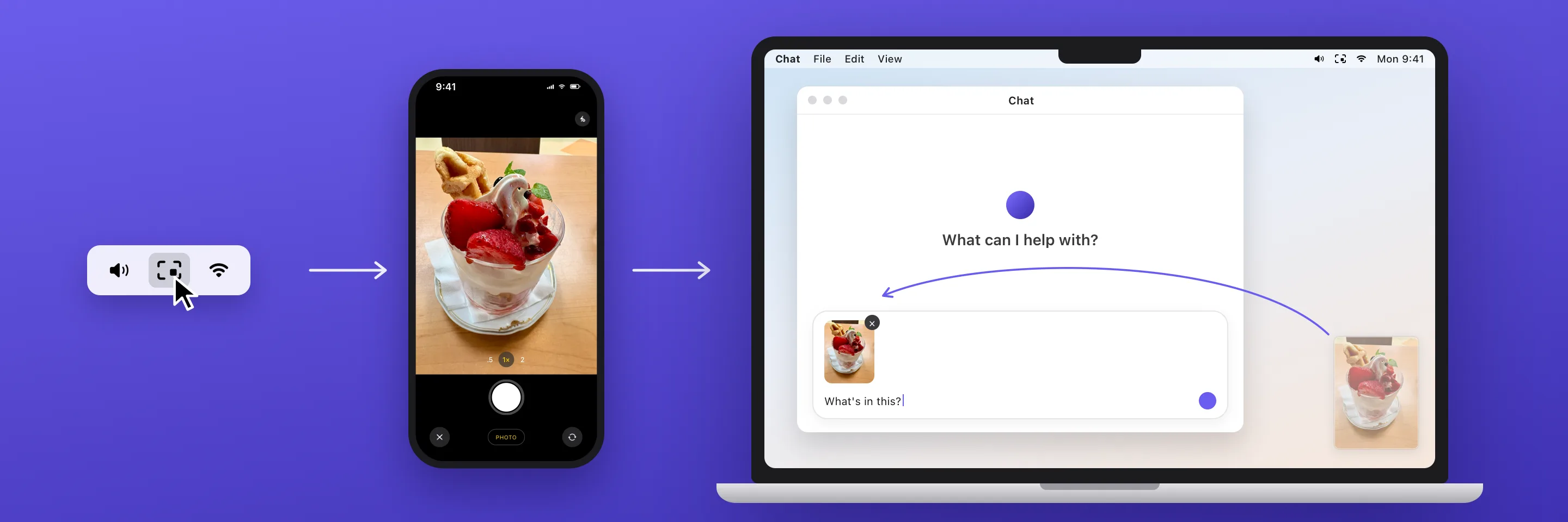
Click the menu bar icon and your iPhone’s camera opens. The photo then lands in the corner of your Mac’s screen. We designed it by reducing the task to a single action.
Illustrations
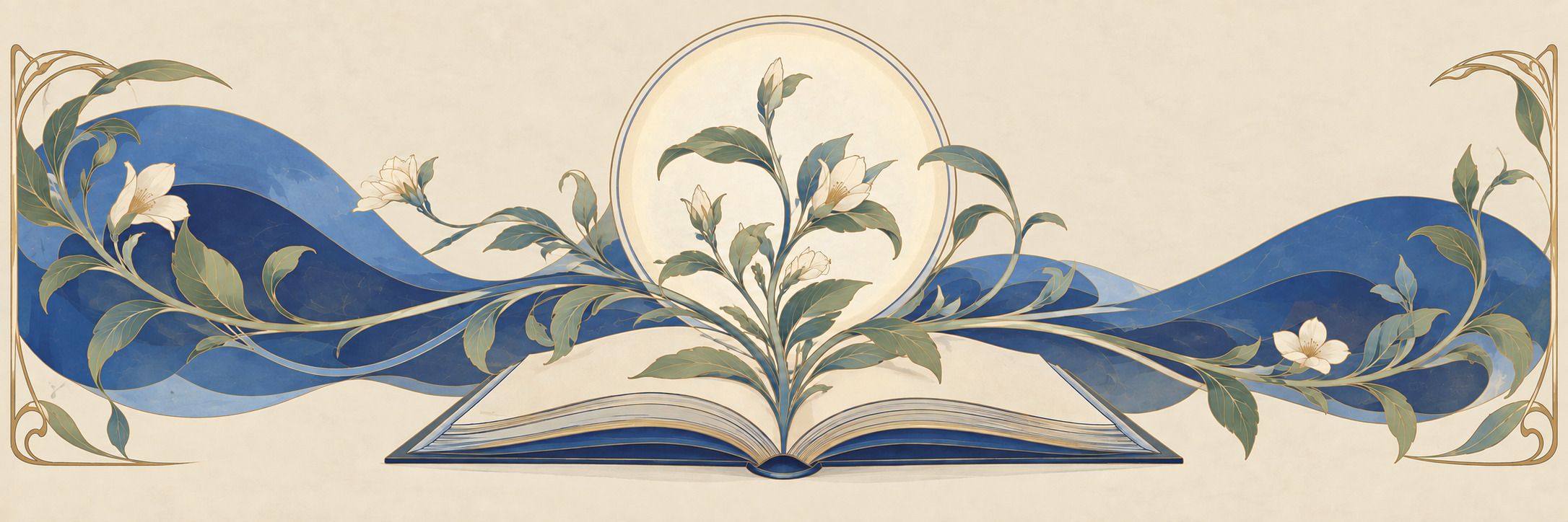
Illustrations that take their cue from the ornament of posters and book covers a century ago: botanical curves, round frames, and lines of gold, redrawn in our own colors and to our own rules. We chose the references and wrote the rules, then made them with an image-generation model.